Essential Web Design Principles Every Freelance Designer Should Know
Post Statistics
This post has 1817 words.
This post will take about 8 minute(s) to read.
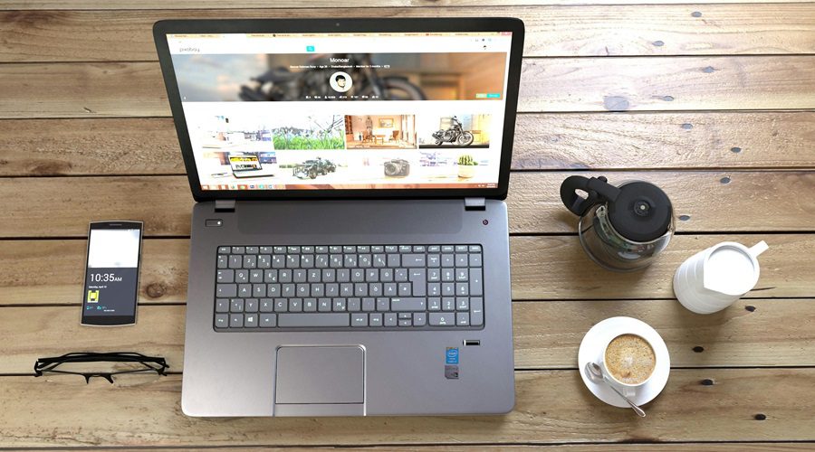
Typography is one of the most critical aspects of web design. This is some essential web design principles all designers should understand. Choosing the right fonts can profoundly influence the readability, accessibility, and overall aesthetic of a website. A well-chosen font can convey the tone and personality of a brand, while a poor choice can make content difficult to read and dissuade users from engaging with the site.
When selecting fonts, consider factors such as readability, scalability, and compatibility across different devices and browsers. It’s also essential to maintain a balance between aesthetics and functionality. Employing a limited number of font styles—typically no more than three—can help maintain a cohesive and professional look.
Choosing the Right Font for Your Brand Identity
You’ve probably noticed how different fonts evoke different feelings. For example, serif fonts like Times New Roman feel formal and classic, while sans-serif fonts like Arial are clean and modern. When designing for a client, choosing the right font can impact how their brand is perceived. Is the business professional and trustworthy?
Or perhaps fun and creative? A bold, blocky font can create a sense of authority, while a playful script can make a site feel more casual. The right font makes all the difference in how a brand’s personality shines through on the web.
As a freelance web designer, your font choices can make or break a site’s overall vibe. A mismatch between typography and the client’s brand can leave users feeling disconnected. Make sure your fonts align with the brand’s identity and communicate the right message without overwhelming visitors.
Creating Visual Hierarchy Through Font Size and Weight
Typography isn’t just about picking a nice-looking font—it’s also about using it to guide your readers’ eyes. This is where visual hierarchy comes into play. When you use different font sizes and weights strategically, you can direct attention to the most important elements of the page. Larger, bold fonts are great for headlines or key points, while smaller, lighter fonts work well for body text or less crucial information.
Think of it as a way of giving users a roadmap. You don’t want them to get lost, right? Visual hierarchy helps visitors navigate your site without even thinking about it. Their eyes will naturally be drawn to the boldest, biggest text first, then flow down to the less prominent details.
As a freelance designer, mastering this principle will elevate your web design game and make your layouts more intuitive.
Using Typography to Boost Readability and User Experience
Readability is another huge factor in web design, and typography plays a big role in it. Have you ever tried to read a website with tiny, cramped text? Frustrating, right? You want to ensure that visitors to your website, or your client’s site, can easily read everything without straining their eyes.
That means choosing fonts with good spacing and making sure text sizes are large enough for everyone, even on smaller screens.
Also, consider the line length and spacing between lines (known as leading). If your text is too tightly packed, it can feel overwhelming. On the other hand, too much space between lines can disrupt the reading flow. You’ve got to strike a balance that makes the content easy to read while keeping the design visually appealing.
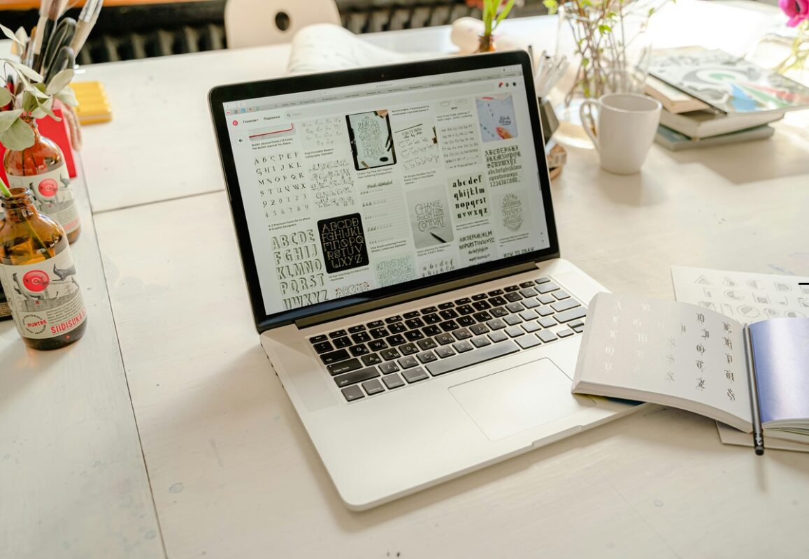
Font Pairing: How to Make Multiple Fonts Work Together
Ever tried to mix two fonts that just don’t get along? It’s like trying to pair peanut butter with pickles—it just doesn’t work. The same goes for web design. Pairing fonts can be tricky, but when done right, it creates contrast and interest without causing confusion.
A good rule of thumb is to choose one font for headings and another for body text. Stick to fonts that complement each other—one bold, one simple—or fonts that share a similar style but offer enough difference to keep things visually interesting.
When you’re freelancing, you might work with clients who have no idea what “good typography” means, so it’s up to you to make sure their website has a cohesive, professional look. The secret to successful font pairing is balance.
Too much contrast can look chaotic, while not enough can make the site seem flat. So take your time when choosing fonts and remember simple is often better!
In web design, typography is more than just text—it’s an essential tool for shaping user experience. By choosing the right fonts, creating visual hierarchy, and boosting readability, you’ll ensure your freelance web designs leave a lasting impression.
Color Theory: Creating Harmonious Palettes
Color theory is fundamental in web design as it helps create visually appealing and emotionally resonant designs. A harmonious color palette can enhance the user experience, guide the user’s eye, and evoke specific emotions and responses. Understanding the basics of color theory, such as complementary, analogous, and triadic color schemes, is crucial for creating effective designs.
In practice, it’s essential to consider color contrast for readability, especially for text and background combinations. Accessibility should also be a priority, ensuring that color choices are inclusive and considerate of users with color vision deficiencies. Tools like color contrast checkers can be invaluable in this process.
The Importance of Layout and Composition
A well-thought-out layout and composition are key to creating a user-friendly website. The layout dictates how information is organized and presented, which can significantly impact how users interact with the site. Good composition guides the user’s eye through the content in a logical and intuitive manner.
One of the essential web design principles is a good use of grid system, white space (or negative space), and visual hierarchy are foundational in achieving an effective layout. The grid system helps create a structured and balanced design, while appropriate use of white space prevents the design from feeling cluttered. Visual hierarchy ensures that important elements stand out and are easily accessible to the user.
User Experience (UX) Design: Crafting Intuitive Navigation
User experience (UX) is another use of essential web design principles that focuses on creating websites that are not only visually pleasing but also easy to navigate and use. Intuitive navigation is a cornerstone of good UX design, helping users find the information they need quickly and effortlessly. Clear, consistent, and logical navigation structures improve user satisfaction and engagement.
Effective UX design involves understanding the user’s journey and designing navigation elements that align with their needs and expectations. This includes organizing content in a way that makes sense to the user, using familiar icons and labels, and ensuring that navigation menus are accessible and responsive across all devices.
If you want to learn more about why a poorly built website is bad for business, click here.
Effective Call-to-Actions (CTAs) that Drive Engagement
Call-to-actions (CTAs) are essential components of a website, guiding users towards desired actions such as signing up for a newsletter, making a purchase, or contacting the company. Well-designed CTAs can significantly boost user engagement and conversion rates.
To create effective CTAs, focus on clear and compelling language that communicates the value of the action. Placement, design, and color are also critical—CTAs should stand out from the surrounding content and be easy to find. Testing different variations of CTAs can help determine which designs and messages resonate most with your audience.
Visual Hierarchy Does Matters in Web Design
Visual hierarchy is all about organizing elements on a webpage in a way that communicates importance. It’s like giving your users a road map to follow. You don’t want them wandering aimlessly around the page, unsure of where to look next.
By controlling the size, color, and positioning of elements, you can direct users’ attention to the most important parts of the website.
For example, your headlines should be big, bold, and at the top. This naturally draws the eye to the headline first. Then, you can guide users to smaller sections, like subheadings or body text.
As a freelance web designer, knowing how to create a logical flow on the page ensures your client’s visitors stay focused on what matters most.
Using Size and Scale to Lead the Eye
One of the simplest ways to create visual hierarchy is by adjusting the size of different elements. The bigger something is, the more attention it grabs. This is why you see huge, eye-catching headlines on most websites—they’re designed to be the first thing you see.
But size isn’t the only factor. You can also use scale to create a sense of depth and importance. A large, bold title followed by smaller, subtler text makes the page feel well-structured and easier to digest.
In web design, the proper use of size can make all the difference between a site that feels intuitive and one that leaves users confused. It’s all about creating a balance where the most important content naturally stands out.
Color and Contrast: Creating a Visual Pathway
Color and contrast are powerful tools for building visual hierarchy. Think of them as your traffic lights. A brightly colored call-to-action button immediately stands out, signaling users to click there first. Meanwhile, muted colors can be used for less crucial elements to ensure they don’t steal the spotlight.
Contrast works in much the same way. By placing dark text on a light background (or vice versa), you make sure your content is easy to read. A lack of contrast can make text blend into the background, making it hard for users to know where to look next.
When freelancing, clients might not always understand how vital color choices are in web design. It’s your job to educate them on how color can create a seamless, visually appealing and essential web design principle that matches the mood of your business.
Spacing: Less is More
Whitespace, also known as negative space, is often overlooked but incredibly important. It’s like giving your design room to breathe. When everything is crammed together on a page, it feels cluttered and overwhelming. But when you strategically leave space between different elements, the important stuff stands out more.
Think of whitespace as the quiet pauses in a conversation—it gives your brain a break and makes it easier to process information. In web design, good use of spacing helps avoid sensory overload and keeps users focused on what you want them to see. It’s a subtle way to make your designs feel more polished and professional.
In freelance web design, an essential web design principle in terms of visual hierarchy is your secret weapon for guiding users through a website seamlessly. By using size, color, and spacing, you create a design that’s not just beautiful but also functional. With these principles in your toolkit, your web designs will keep users engaged and coming back for more!